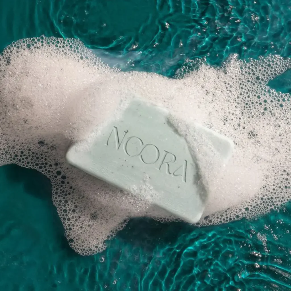
Noora needed a logo. We gave them a whole personality.


Noora is a premium organic skincare brand based in Morocco, inspired by the meaning of its name—light in Arabic. The founder’s vision was to create more than just skincare products, but a brand that conveys calmness, clarity, and emotional warmth.
We were responsible for shaping this vision into a cohesive brand system, including strategy, creative direction, and visual identity.
The Challenge
The organic skincare market is highly saturated, with many brands competing through bold visuals and strong claims.
The core challenge was:
How do we create a brand that feels distinct and premium without being loud or overdesigned?
Additional challenges included:
- Translating an abstract concept (light) into a clear visual system
- Communicating purity without feeling generic
- Maintaining a premium position while staying soft and approachable
Our Approach
We approached Noora as an experience rather than just a product. The starting point was defining the emotional core of the brand softness, purity, calm confidence, and intentional beauty.
From there, we made a conscious decision to build the identity through restraint. Instead of adding more elements, we focused on removing anything unnecessary, allowing the brand to feel light not just visually, but experientially.


Brand Strategy and Direction
We began by defining the emotional core of the brand.
Noora represents:
Softness, purity, calm confidence, intentional beauty. From there, we built a brand direction centered around natural luminosity and understated elegance.
Visual Identity Development
The visual identity was designed to feel refined and breathable. We used soft typography, warm neutral tones inspired by natural light, and a structured layout system that creates a sense of calm and balance.
Rather than relying on decorative elements, the system depends on consistency and precision. The result is a visual language that feels quiet but confident, aligning with the brand’s premium positioning.

Creative Direction
Instead of trying to stand out through intensity, the brand stands out through control and subtlety—creating a more intimate and elevated experience.
Impact & Result
The brand successfully translates an abstract idea—light—into a consistent and tangible experience
What We Delivered
- Layout and design guidelines
- Brand strategy and positioning
- Creative direction
- Visual identity system
- Typography and color system
Noora now has a cohesive premium brand identity that reflects its essence. The brand feels light in every sense. Visually, emotionally, and strategically.